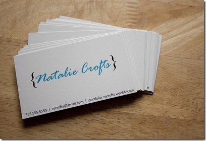
I’m going to Vegas next week for the Society of Professional Journalists National Convention, and when my professor sent us a list of things to pack, he included on it resumes. This made me excited because of an idea from one of our briefers in D.C. They said one of the coolest things they had seen was a girl who gave them a business card that was really a mini-resume. Ever since I’ve wanted to make one for myself. If you think about it, the idea makes a ton of sense, especially for those of us who theoretically should be starting to think about looking for a job. Or something.
This provided me an excellent excuse to play with InDesign, which I have been missing. I only ordered 20 cards because I really anticipate giving maybe one away, but it was still pretty fun playing grown-up. Maybe they’ll have one of those sweet business card raffle jars and I can stick one of these in.
You’ll have to let me know what you think, though, since this was an experiment. I couldn’t decide between super traditional and, well, something that would stand out but could be potentially tacky, so I tried to design something in between. During one of my summer jobs I literally went through stacks and stacks of resumes of people applying for teaching positions at PCC, and I saw a lot of over the top ones that turned me off (all pink floral with a scent? Is that necessary?), but also millions more that looked like they had used the same template in Word.
Which reminds me, I should probably work on my real resume because I definitely used one of those Word templates. My bad.
Front:
Back:


i like it! way to go natalie!
ReplyDeleteSo adorable! They remind me of my yearbook I made with the brackets. I love it!
ReplyDeleteWow Natalie, I LOVE IT. Seriously, very cool.
ReplyDelete